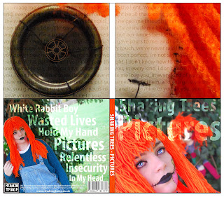
For example, we have used the same colour throughout the branding, digipak and music video so it all looks coherent and relative to each other. We used bright oranges and greens to associate with the mise en scene and the setting of our music video and photo shoot for the digipak. Throughout the digipak we used the colour code C=10% M=68% Y =97% K=1% HTML code – dc6f2cd for orange, so all the panels looked coherent and connoted the costume of the doll in our video. We also used the same font throughout the advert and digipak to give a sense of relevance between the products, so viewers can associate them with each other for marketing purposes.
However, our digipak wasn't as coherent to our music video as it could be as the costume of the doll slightly changes between the products. This could cause an issue in product relevance. Even though the change isn't that big, its still noticeable. Also, the fact that both dolls are present together in the digipak, however they are separate in the video. This says that they are different in the digipak, on the other hand in the video they are both the same.
The lighting we have used is the same in the digipak, advert and music video as we aimed to get a bright look on our shots to allow all the colours and detail to stand out.
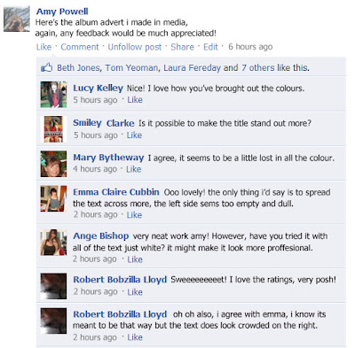
When we posted our Advert and digipak to facebook to gain feedback we got these results.

From this specific piece of feedback, I learned that to make my advert more effective I should of made the title stand out more by making all the text white, instead of using the opacity effect I made on the title, and spread it out a bit more, and not have all the text clumped to the right hand side.

Again, the main criticism for my album was the text, and how some of it is hard to read from a distance because of the opacity settings.To make it better, i should of made all the text on my digipak and advert white to make it coherent and easier to read.


No comments:
Post a Comment