During this porject, I feel that different media technologies have helped me on the course to create effective products similar to real media products. Without these different technologies, I couldn't of been as creative as i would of been due to limitations. I have used technologies ranging from physical equipment, professional software and a variety of online resources open to the public.
Online
Throughout the whole project I have actively used the technologies of Blogger to keep record of my project and post my work, I have also used Google extremely usefully to search for new ideas and for research. I found Blogger very useful in organizing my work, and even more useful on recalling work I had done weeks ago to bring forward to help with filming. As long as I had WiFi, I could access Blogger on my iPod or iPad, making it extremely useful to recall work up when i'm moving.
Facebook has also been a very useful technology for me as its provided an easy way to gain audience feedback on work I have previously posted on there. Thanks to technological convergence, I had the luxury of accessing Facebook feeds on my phone, making sure that i could access this feedback when we were out filming for our video. Also, Facebook sued real time technology, which made it easier for me to gain feedback extremely quickly and efficiently.
Software
The availability of advanced software has been extremely useful to me in my project and has enabled me to create work I couldn't make without it. I already had extensive knowledge of the Adobe suite as i had used it quite often before. Adobe Photoshop was very useful in my print task, for example, the tools in the program were useful in helping me edit my work. The dodge/burn tool helped me darken/brighten parts of the pictures, I could add colour filters to slightly change the tone of the picture and use the magic wand tool to select parts of the photo to edit and change.
For editing, I used a program called Adobe Premier which allowed me to edit the clips I had recorded earlier. I could cut clips down, extend them, speed them up, rewind them and place them in time with the music. This was useful when it came to lining up the lip syncing with the music to make it look realistic.
Equipment
For my photography work, I used a digital SLR camera for my still shots and stop motion animation. They were very useful with out still shots for our digipak as I found them simple to use and took photos quickly and easily, of a high quality. These cameras also made our stop motion increasingly simple, as all we had to do was photograph a series of images, in order, that we wanted to animate, then followed the directions through settings>animate>stop motion>AVI. It quickly merged our images into a stop motion film of about 14 frames per second. Fast enough to move, yet slow enough to give our film a 'home made stop motion' effect.
For our filming work, we used a HD handheld camera, with attachable tripod. These cameras were simple to use and control and were very useful, as they recorded our clips in full high definition. The only thing I found difficult about the equipment was importing the video clips into premier for editing, as more than once I lost footage because I hadn't saved it into the right place. If I did this project again, I would be sure to take more care with importing files.
Amy Powell A2 Media Studies
Friday, 9 March 2012
What have you learned from your audience feedback?
Once we had finished our music video, we showed it to the rest of our class and got them to write down what they thought of our task. Here is a few notes we collected on our music video.
Also, I filmed two of my peers when i asked them questions on my music video, to record their feedback and criticisms.
what happens in the narrative?
Most people we have gained feedback from have been understanding of the narrative and support its entropic idea, however a few have struggled to understand this, showing that it would of been better to make it more understandable for everyone by showing a stronger story line in the video.
does the performance look convincing?
Overall, they have said that the performance is convincing, as you can see clearly in every shot whats going on and whats happening. On the other hand, again some people have said that its been hard to understand at times and haven't fully embraced the disjunctive nature of the video. They have also said that the video fits in with the house style of the genre and that the video fits with the song.
does it remind you of any other music videos or other texts?
Some people thought our video was very original in some terms, like the mise en scene was very home made and individual to other media products already out there. But a few people pointed on the fact that it was a little bit similar to the Florence and the machine video 'dog days are over' as they were our main inspiration for the task.
would you like to be friends with the people in the video?
The answer to this question was yes and no, as some people had said that they could connect with the character in the video, whilst some people commented on the scary look of the msie en scene and costume that had put them off.
what genre of music do you think the video is appropriate for?
Everyone we gained feedback from stated that the video was suitable for the folk/indie style of the song, however one commented on an alternative genre because of the strong drum beats in the song.
if you could change one thing, what would it be?
Most people commented on our editing speed and how it was slow in some places. We also got comments on how our lip syncing was out of time in specific places due to the actor being partially out of sync with the audio.
If I could go back and change certain aspects of my video, I would make the narrative easier to understand by paying more attention to the story line, and not getting carried away by using too many cut-away shots. I would also re-film my lip syncing shots to get them exactly in time with the editing to make the video seem more effective and realistic.
How effective is the combination of your main product and ancillary texts?
For our products, we made the branding coherent to the band. We tried to recreate shaking tree's folk genre in our digipak and music video. We did this so its easier for people to associate the band with the video, the video with the album ect. It all fits in with the same style for easy association with the genre and products.
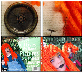
For example, we have used the same colour throughout the branding, digipak and music video so it all looks coherent and relative to each other. We used bright oranges and greens to associate with the mise en scene and the setting of our music video and photo shoot for the digipak. Throughout the digipak we used the colour code C=10% M=68% Y =97% K=1% HTML code – dc6f2cd for orange, so all the panels looked coherent and connoted the costume of the doll in our video. We also used the same font throughout the advert and digipak to give a sense of relevance between the products, so viewers can associate them with each other for marketing purposes.
However, our digipak wasn't as coherent to our music video as it could be as the costume of the doll slightly changes between the products. This could cause an issue in product relevance. Even though the change isn't that big, its still noticeable. Also, the fact that both dolls are present together in the digipak, however they are separate in the video. This says that they are different in the digipak, on the other hand in the video they are both the same.
The lighting we have used is the same in the digipak, advert and music video as we aimed to get a bright look on our shots to allow all the colours and detail to stand out.
When we posted our Advert and digipak to facebook to gain feedback we got these results.

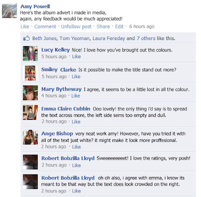
From this specific piece of feedback, I learned that to make my advert more effective I should of made the title stand out more by making all the text white, instead of using the opacity effect I made on the title, and spread it out a bit more, and not have all the text clumped to the right hand side.

Again, the main criticism for my album was the text, and how some of it is hard to read from a distance because of the opacity settings.To make it better, i should of made all the text on my digipak and advert white to make it coherent and easier to read.
For example, we have used the same colour throughout the branding, digipak and music video so it all looks coherent and relative to each other. We used bright oranges and greens to associate with the mise en scene and the setting of our music video and photo shoot for the digipak. Throughout the digipak we used the colour code C=10% M=68% Y =97% K=1% HTML code – dc6f2cd for orange, so all the panels looked coherent and connoted the costume of the doll in our video. We also used the same font throughout the advert and digipak to give a sense of relevance between the products, so viewers can associate them with each other for marketing purposes.
However, our digipak wasn't as coherent to our music video as it could be as the costume of the doll slightly changes between the products. This could cause an issue in product relevance. Even though the change isn't that big, its still noticeable. Also, the fact that both dolls are present together in the digipak, however they are separate in the video. This says that they are different in the digipak, on the other hand in the video they are both the same.
The lighting we have used is the same in the digipak, advert and music video as we aimed to get a bright look on our shots to allow all the colours and detail to stand out.
When we posted our Advert and digipak to facebook to gain feedback we got these results.

From this specific piece of feedback, I learned that to make my advert more effective I should of made the title stand out more by making all the text white, instead of using the opacity effect I made on the title, and spread it out a bit more, and not have all the text clumped to the right hand side.

Again, the main criticism for my album was the text, and how some of it is hard to read from a distance because of the opacity settings.To make it better, i should of made all the text on my digipak and advert white to make it coherent and easier to read.
Monday, 27 February 2012
In what ways does your media product use, develop, or challenge forms and conventions of real media products?
In this essay, I am going to discuss the different ways our product used and challenged conventional forms of real media products. I am also going to discuss how we developed the idea from inspiration and research on already existing products.
To help us with our planning and research, we reviewed and watched similar media products in the genre we wanted to work in. For example, we wanted to work in an indie, folk style to connote the genre of the song we chose. To do this, we singled out a few bands we found, such as Ok Go, Arctic monkeys, and our main style influence, Florence and the Machine.
Here, you can see we were mainly inspired with the mise en scene of Florence and the machines video 'the dog days are over'. We liked the way how they ahd designed the costumes of the dolls to give them a Halloween, 'macabre' style in a normal, everyday setting of a woods. To show how this video inspired us in our own, we decided to recreate the dolls style into a more friendly, appealing look to please and amuse our viewers.
Our audience research directed our creativity and inspired us to try and make something different and unpredictable to make it satisfying and keep our viewers engaged. To help us create what our target audience wanted to see, we asked them half way through production about how we could improve our project. The main point that came up was out editing speed, so to change this we made it faster in some places and tried to tie it in with the beat of the music. Once we had done this, we showed our audience again, and they commented on an improvement, and said that the video felt more like the song.
Our media product is a lot different to other media products as we had to plan our budget to a very low degree and use the technology available, this limited our ideas on what we could do using the resources to make our video as effective as it could be. To do this, our video had a very prominent 'home made' effect which made us stand out from the real professional media products as ours looked carefully made, instead of investing in powerful CGI to do our work for us. This home made effect makes our video look highly created, as all the costumes, make up, sets ans stop motion was all hand made by us, this also made it original as we had made it ourselves without the help of others, giving our product a really individual feel.
To a broad extent, we have been very original with our video, by making our own costumes, sets, make up and so on. We have also combined stop motion with real footage, as we saw this would make our video stand out from many as this technique isn't widely used in the genre we chose.
To an extent, entropy has been used to give our music video a disjunctive effect. We chose to do this to engage the viewers to make them think about the video and whats happening in it. After showing this to friends, we have found out that this entropic effect is very good at making the viewers question the video and the narrative, and get them talking about it afterwards. This would be very effective in the industry as it would be easy for us to get people talking about our video, as a positive word of mouth would help our marketing strategy of our products.
In our video, we challenged the conventions of narrative, and tried to show that we didn't have to follow a clear story line to make a music video. This was difficult as once we gained audience feed back, we received comments such as 'it didn't make sense' and 'there was no clear narrative'. This shows that people are expecting music videos to have a clear narrative and story line and would judge on this point. We also challenged mise en scene and tried to create our own costume based upon the macabre/folk style of Florence and the machines costumes in their music video 'dog days are over'.
Friday, 10 February 2012
Monday, 19 December 2011
Friday, 16 December 2011
Subscribe to:
Posts (Atom)


